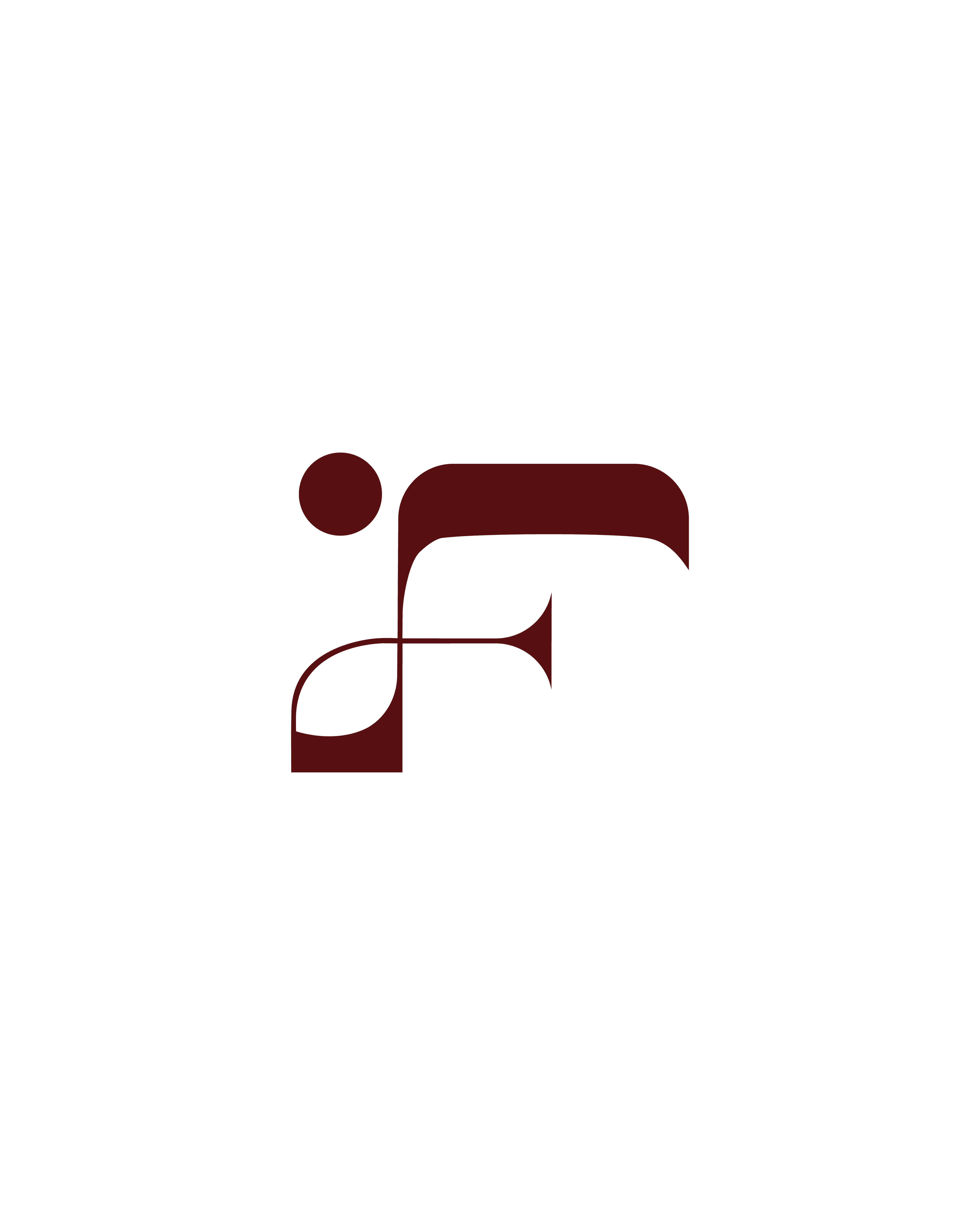
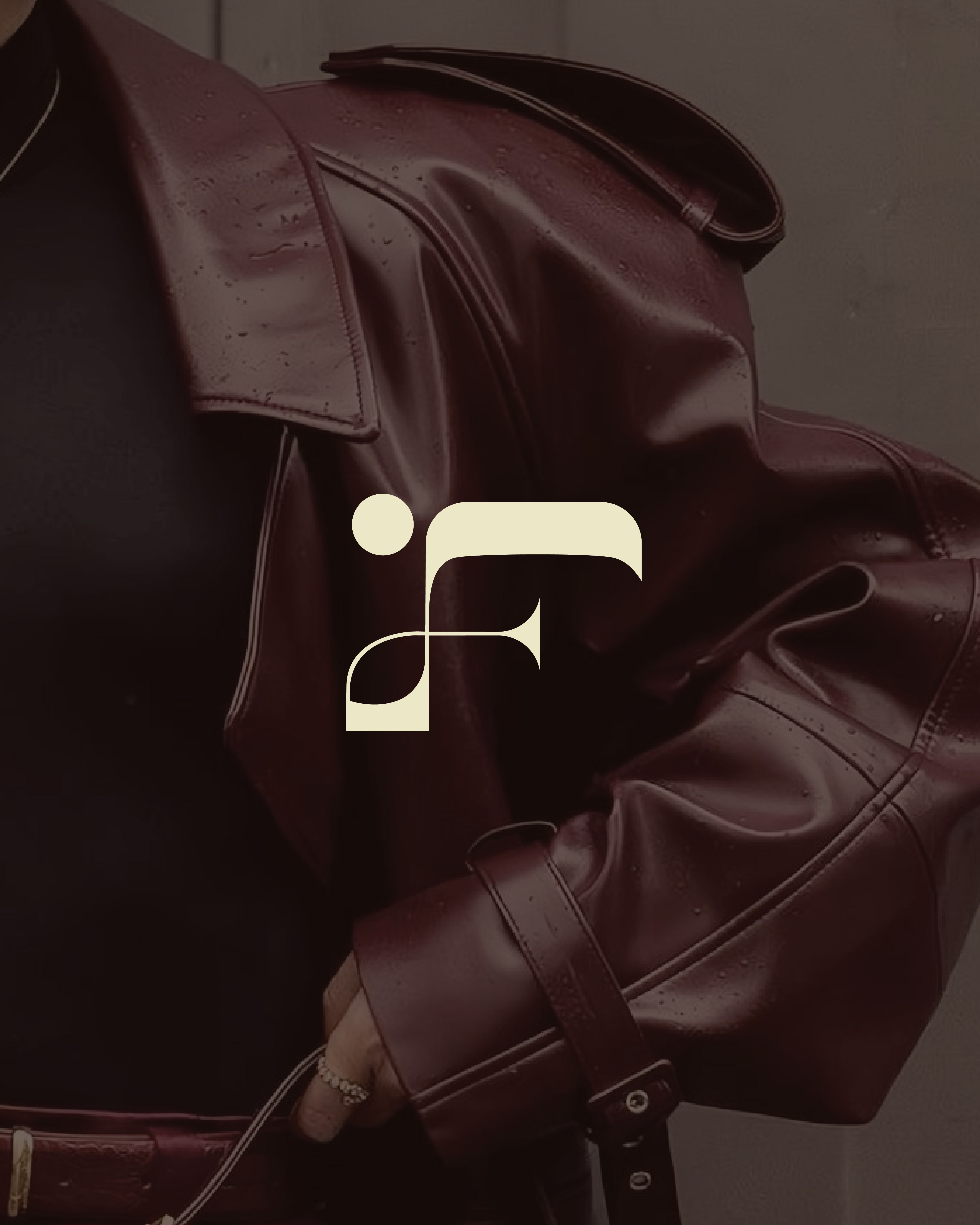
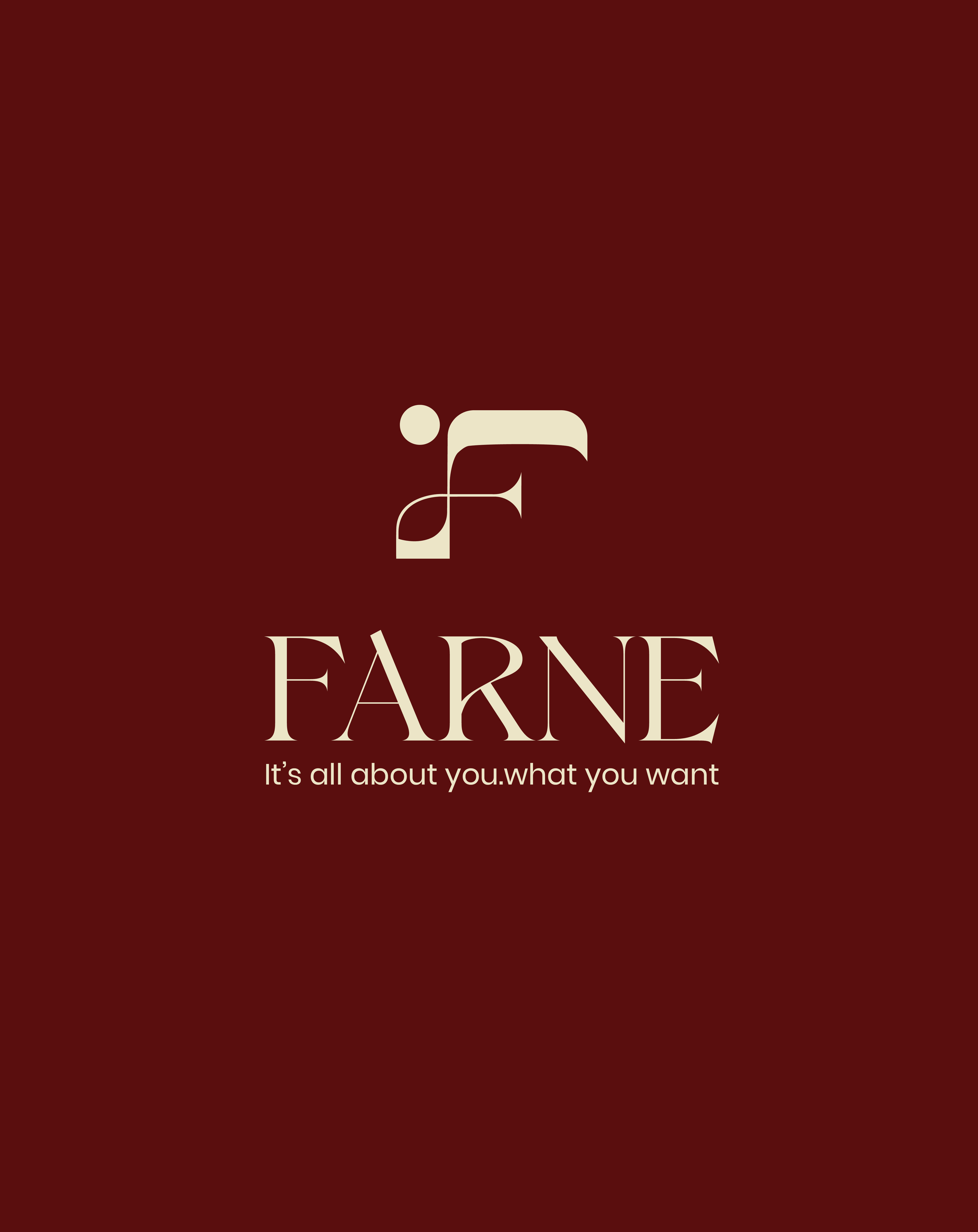
The logo merges the letters F and N in a minimal monogram, reflecting Farne's fusion of heritage and modern identity.
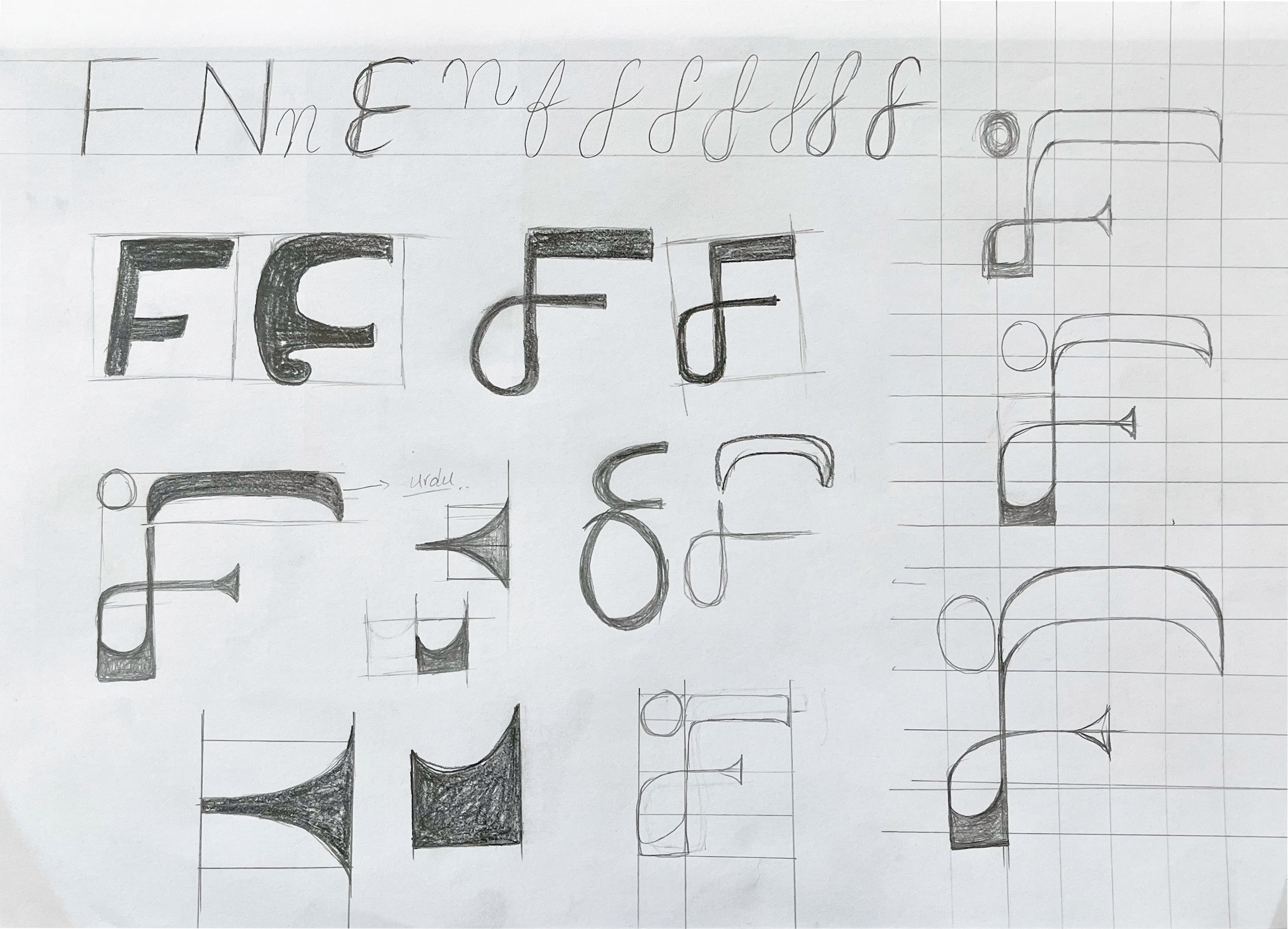
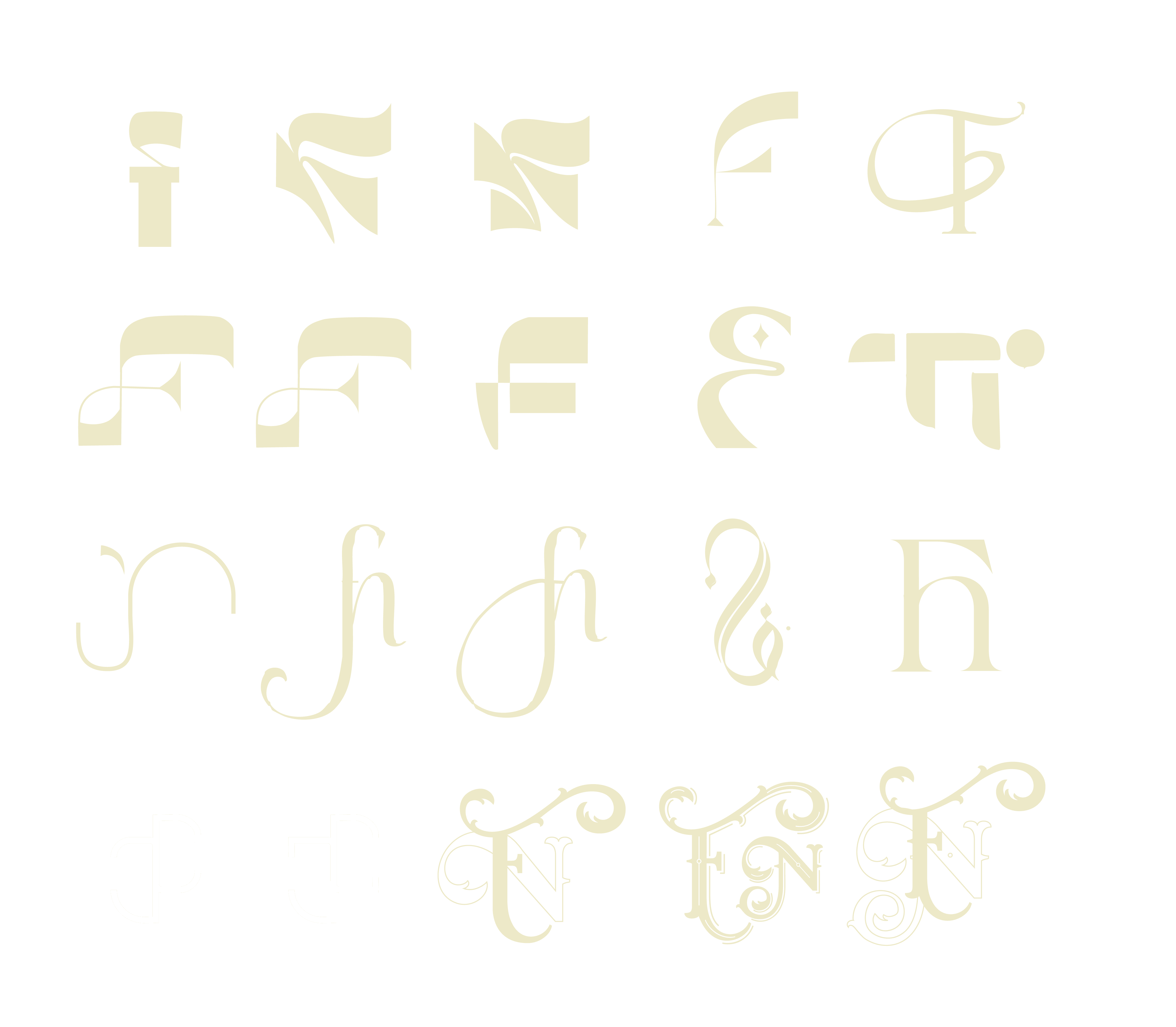
Here, I explored different ways to merge the “F” and “N” in a way that feels flexible, fresh, and future-ready — perfect for packaging, stitching tags, and digital spaces.
Brand Identity: Farne
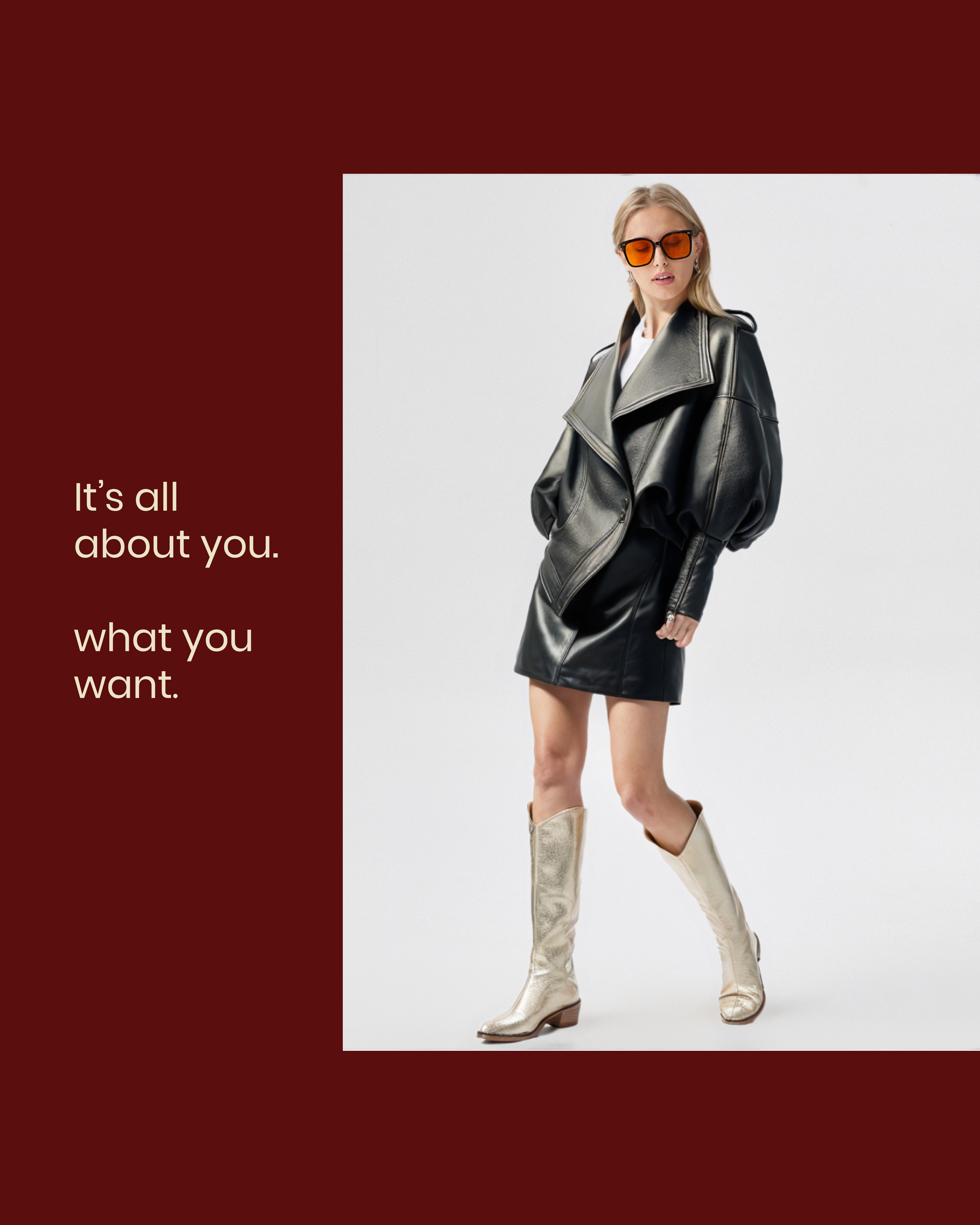
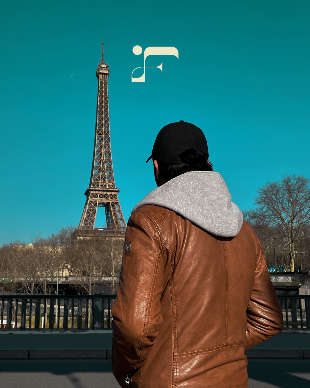
Farne is a personal and professional brand rooted in the power of cultural fusion, custom design, and meaningful creation. The name represents individuality, confidence, and connection — a bridge between tradition and modern design.
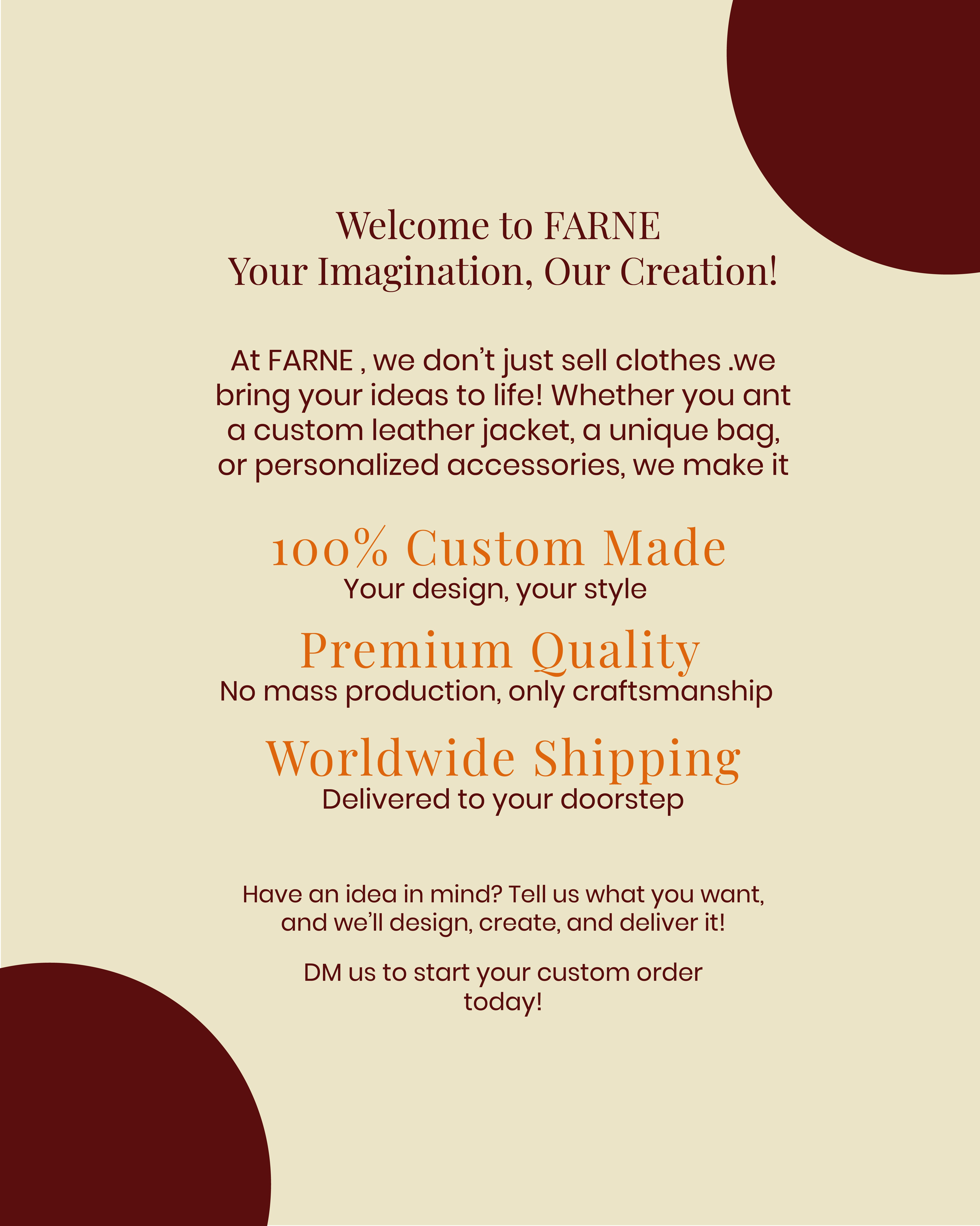
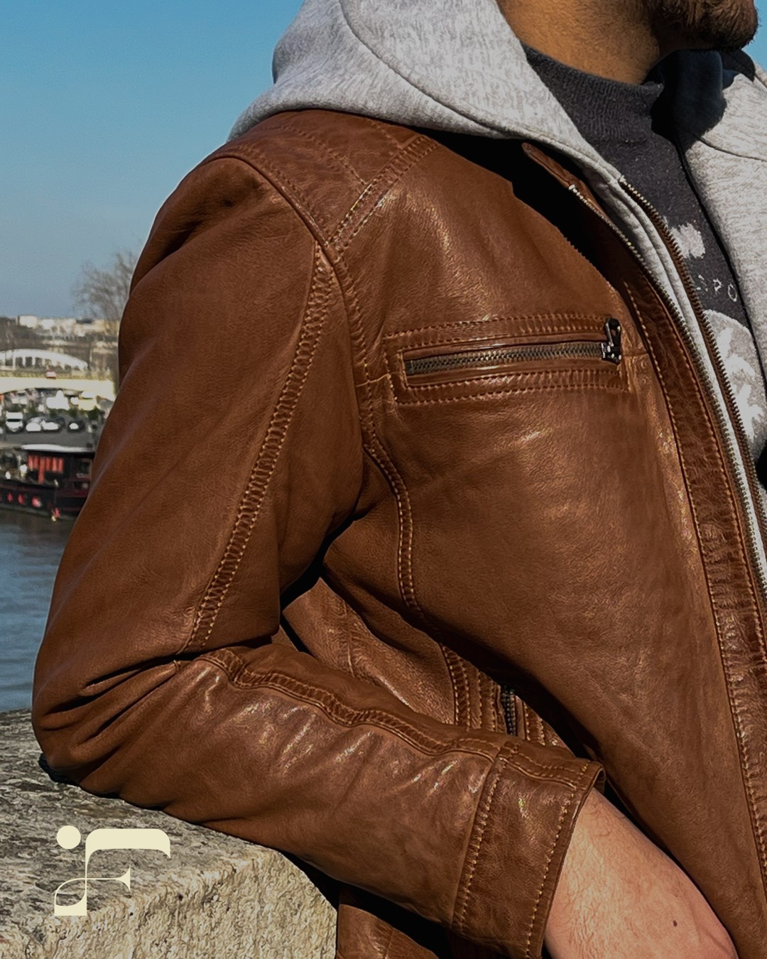
It’s more than a label — Farne is a statement. It supports local craftsmanship in Pakistan while delivering modern, global aesthetics to clients worldwide.
Concept
Logo Concept
The Farne logo is a minimal and strong symbol combining the letters F and N, drawn from the founder's initials. The design focuses on:
Bold lines representing structure and clarity
Balanced negative space reflecting harmony between culture and creativity
Modern yet timeless shapes to fit fashion, product, and digital presence
Sketches & Exploration
This project represents my passion for design and my belief in meaningful craftsmanship. Farne is not just a brand — it's a journey I’m proud to share
From pencil to pixels — the Farne logo was born through layers of exploration.
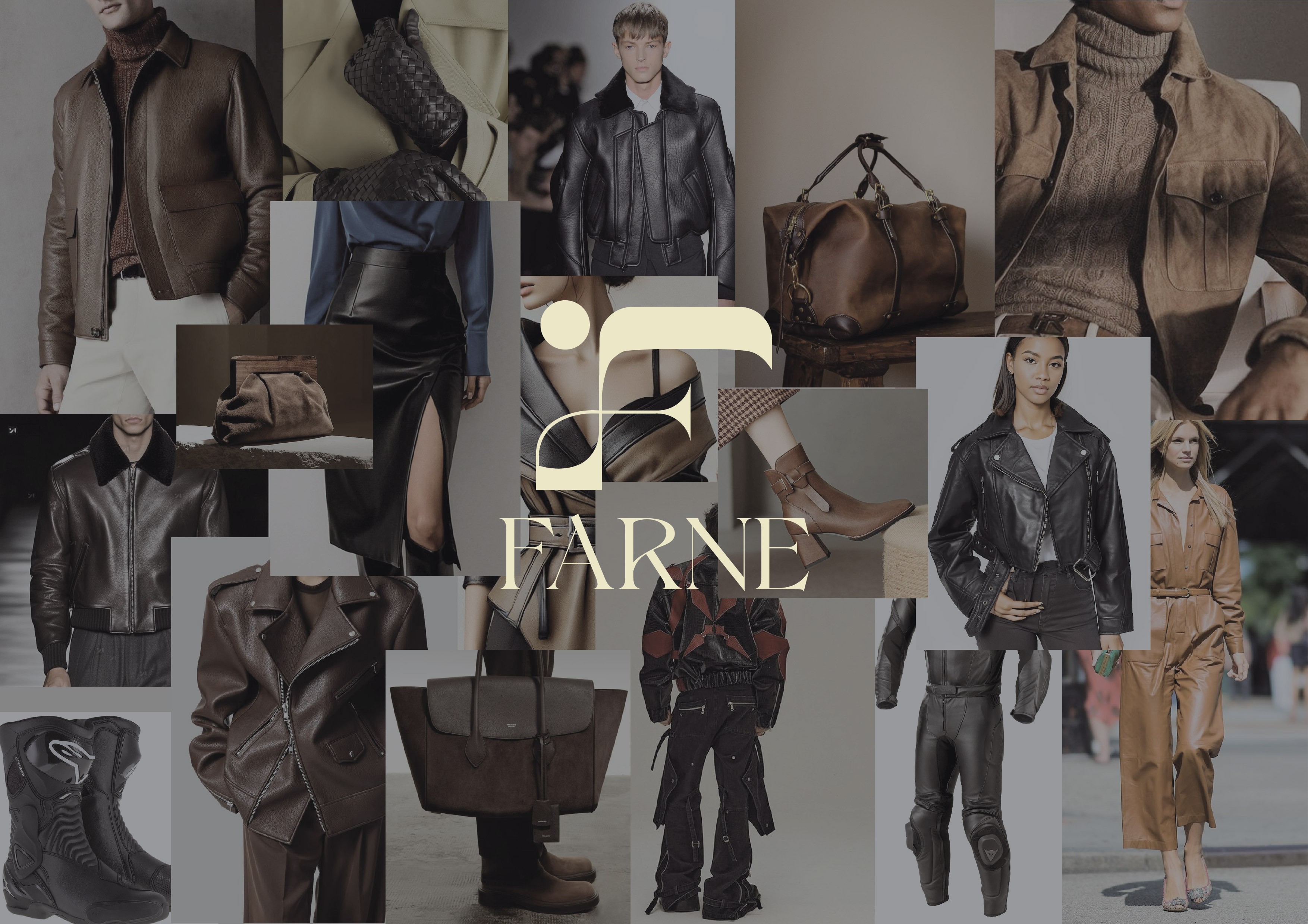
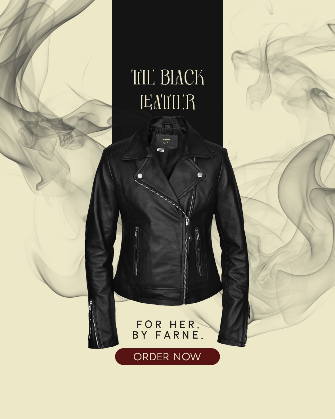
Products